To explain the design process in creating a logo and brand identity, let me take you through the steps and decisions I made in creating the branding for this site.
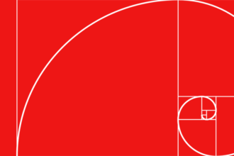
I’ve always been fascinated with geometric shapes. Especially circles. Even fractions of circles. There are many examples of work by artists and designers using combinations of circle-derived elements in their creations. Whether the work is displayed in a gallery or featured on the cover of an annual report it fascinates me how these basic shapes can be the subject of such diverse interpretation.
The quarter circles used to create the Daryl Woods Design logo weren’t part of my vision at the beginning of the design process. As is the case for any client project there is a lot of open-minded exploration involved. You can see from the early sketches, the final direction came at a much later stage. However, once I started experimenting with the quarter circles I became obsessed with making it work.
I was difficult to explore alternatives with repetitive sketches. Taking the process to the computer where I could easily reflect and rotate the elements, duplicate and revise was much faster. From the beginning I envisioned a DW logo. While the final design is most obviously a W the first 2 pieces create an abstract D. It’s a hidden element most won’t see.
Colour was the next challenge. Initially I gravitated toward palettes I had used for my company, Public Image Design. But I wanted this to be a departure. Green isn’t a colour I’ve used often in my work but Woods is my name so it seemed natural. Especially a deep forest shade.
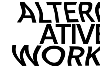
Next was choosing a typeface for the brand name. The average person doesn’t give this much thought. Designers obsess. I have over 1,200 fonts in my system and constantly add more. Here I selected Gotham Book. For client assignments I have reviewed their company or product name in thousands of typefaces to find just the right one. The are so many choices and decisions to be made — all caps, upper and lower case, serif, sans serif, script, hand drawn, bold, medium, light, regular, condensed. And those choices don’t even include the character and personality of the typeface.
Design is a process of decision making. The identity for this site is the result of my choices. Many of those choices are subjective. You or other designers may have chosen differently. I’m confident my final decisions represent my brand as a designer.